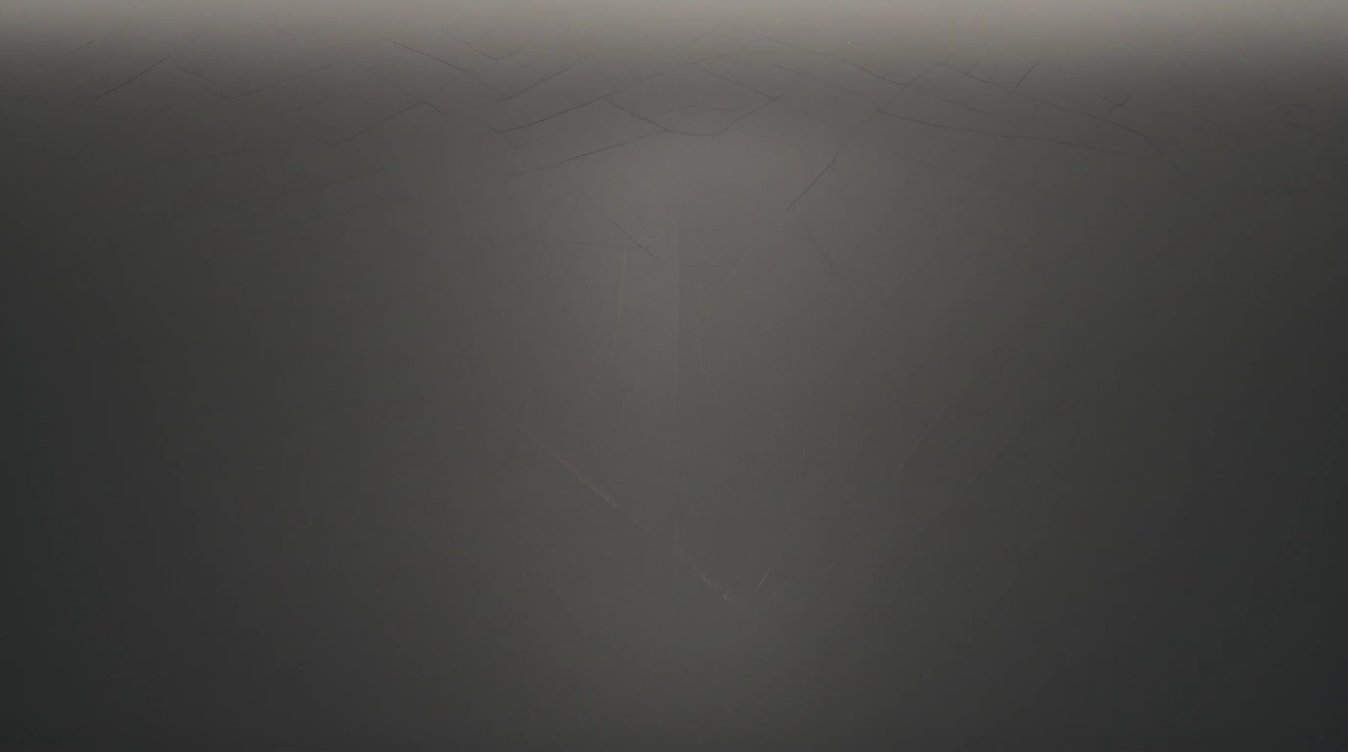
Thumbnail Design by Revenue Format: Shopping, Live, Shorts, Members
One thumbnail style fails across every YouTube revenue format. Here's the visual design logic for Shopping, live streams, Shorts, and memberships.

Most YouTube thumbnail advice treats every video the same: high contrast, expressive face, minimal text, bold sans-serif font. That advice is not wrong. But it skips the most important variable — what the video is actually trying to do economically.
A thumbnail for a Shopping affiliate haul has a different job than a thumbnail for a live stream. A Shorts cover frame serves a completely different discovery context than a membership-exclusive deep dive. When you apply the same visual formula to all four, you optimize for one revenue format and leave the others underperforming.
Creators earning $10,000 or more per month now derive 41% of that revenue from non-ad sources, up from 31% in 2025, according to data published in TechCrunch's February 2026 analysis. YouTube Shopping affiliate revenue grew 52% in 2026. Shorts revenue climbed to 18% of total creator earnings, up from 11% in 2025, per ShortsIntel 2026 data. Super Chat and Super Stickers grew 45% year-over-year.
These are not marginal signals. They describe a platform where most of the interesting money comes from formats that each carry their own visual logic. This guide breaks down exactly how to design thumbnails for each.
Why One Thumbnail Style Breaks Across Formats
The failure mode looks like this: a creator builds a recognizable brand — same color palette, same face angle, same bold text placement — and applies it uniformly. It works for their main channel content because that content built the brand. Then they launch a Shopping affiliate series and wonder why their CTR is lower than expected. They start live streaming and notice their thumbnail impressions convert poorly. They push Shorts and see minimal spillover to their long-form funnel.
The issue is almost always that the thumbnail is signaling the wrong thing for the format. Viewers have internalized what different content types look like. A thumbnail that screams "informational deep dive" will struggle on a Shopping haul video, not because it looks bad, but because it creates the wrong expectation at the click decision point.
Each format creates a different viewer intent, a different discovery context, and a different conversion action the creator wants the viewer to take. Thumbnail design needs to reflect all three.
Stop guessing. Start testing thumbnails.
Paste any YouTube URL and get AI-branded thumbnails in under 60 seconds. Free to try.
Try Hooksnap FreeFormat 1: YouTube Shopping Affiliate Videos
What Shopping thumbnails are trying to do
When you tag products in a video, your thumbnail is doing two jobs simultaneously: it needs to win a click from the algorithm-driven feed, and it needs to attract the subset of viewers who are in a buying mindset. These are not always the same people.
Research from Metricool's 2026 Shopping guide notes that creators in niche markets like skincare or home fitness report Shopping revenue exceeding ad revenue for channels above 100K subscribers. The thumbnails that drive those conversions share specific visual patterns.
Design rules for Shopping thumbnails
Show the product, not just the person. For most YouTube content, a face dominates the thumbnail because emotional expression drives clicks. For Shopping content, the product needs to be visible at thumbnail scale — specifically at mobile thumbnail scale, which renders at roughly 120×67 pixels. If the product disappears at that size, it cannot function as a buying signal.
The product should occupy at least 30-40% of the frame. If you are reviewing a single item, fill the frame with it. A hand holding it, a close-up of its key feature, or a before/after split showing what it does all work better than a product sitting in the background behind your face.
Use text that names the category, not the product. Titles like "I Tested 7 Protein Powders" or "The $40 Skincare Routine That Actually Works" outperform product names in thumbnails because they signal the review angle without requiring viewers to recognize a specific SKU. Text should be 3-5 words, high contrast, and positioned away from the product zone so neither obscures the other.
Color logic for product videos. Avoid using background colors that match the product packaging. This collapses visual contrast and the product disappears into the background. If the product you are reviewing is white and blue, use a warm or dark background behind it.
Face placement. For shopping content, the face works best in a corner reaction pose rather than as the dominant subject. A surprised or skeptical expression in the lower-right while the product takes center-left frame creates both emotional engagement and product clarity. This is different from a talking-head video where the face should dominate.
Format 2: Live Stream Thumbnails
The live stream thumbnail problem
Live stream thumbnails have an unusual constraint: they need to work both before the stream (driving pre-registrations and reminder sets) and as the replay thumbnail after the fact. Most creators set one image and forget it, which means they are optimizing for neither moment particularly well.
The second constraint is that live stream browsing happens in a different mental state. Viewers browsing the Live tab or seeing a live recommendation in the feed are often deciding in real time — "is this worth watching right now?" That is a different question than "do I want to watch this eventually?"
Design rules for live thumbnails
Include a time signal for replays. Once the stream ends, the thumbnail needs to communicate what happened in the stream, not just that it was live. Adding text like "Full 3-Hour Deep Dive" or "Watch the Moment Live" converts the thumbnail from a pre-event promo to a replay magnet. Creating two versions of the thumbnail — one for the live window, one for the replay — and swapping them in YouTube Studio takes about four minutes and measurably improves replay CTR.
The LIVE badge amplifies but does not replace design. YouTube's red LIVE badge boosts CTR on its own, but creators who lean on it as their primary hook tend to see that advantage evaporate the moment the stream ends. Design your live thumbnail as if the badge were not there, then let the badge add on top.
Energy signals matter more than information density. For a live cooking show, a thumbnail of a plated dish does less work than a thumbnail of someone mid-pour with food splashing. For a live Q&A, a thumbnail of you thoughtfully explaining something underperforms one of you with an incredulous expression and a viewer comment in text. Live thumbnails should signal immediacy and stakes. Static compositions communicate the opposite.
Super Chat design consideration. Channels relying heavily on Super Chat revenue benefit from thumbnails that build emotional identification — viewers who feel a parasocial connection are dramatically more likely to Super Chat. Mid-tier creators earn $500-$5,000 per month from Super Chats alone, according to VidIQ's Super Chat guide. Thumbnails that position you as a personality, not just a content deliverer, support that connection. This means faces more often, more expressive expressions, and content framing that suggests conversation rather than lecture.
Format 3: YouTube Shorts
Why Shorts thumbnails are a different design problem entirely
Shorts do not primarily drive clicks through thumbnails. Viewers discover Shorts through the feed swipe, not through a browse decision triggered by a thumbnail. But this does not mean the cover frame is irrelevant — it matters in two specific contexts: when your Short appears in a regular search result or browse recommendation, and when it appears on your channel page as a grid item.
Shorts revenue grew to 18% of total creator earnings in 2026, up from 11% in 2025, and creators posting three to five Shorts weekly alongside long-form content see 23% higher overall revenue than single-format creators, according to ShortsIntel 2026 statistics. The Shorts thumbnail job is about funnel entry, not direct conversion.
Design rules for Shorts thumbnails
Design for portrait, not landscape. This is the most common mistake. Shorts are shot and displayed in 9:16, but many creators upload a 16:9 thumbnail that gets center-cropped. The result is a thumbnail where the key subject — usually your face or the core visual hook — is cut off. Export a dedicated 9:16 cover frame from your Short rather than repurposing a landscape version.
Text needs to be larger than on long-form videos. The Shorts thumbnail renders at even smaller sizes in grid view on channel pages. Text that works at standard thumbnail scale becomes illegible at Shorts scale. Use 60-point or larger text (relative to a 1280px-wide canvas) and limit to three words maximum.
The cover frame drives channel visits, not direct views. Think of your Shorts thumbnail as a billboard that gets someone to your channel page, where they then decide to binge Shorts or switch to long-form. It should communicate your niche clearly rather than trying to hook with a single short's content. A consistent visual language across Shorts thumbnails builds brand recognition faster than optimizing each Short in isolation.
Do not use clickbait framing for Shorts. Because Shorts viewers are discovered by swipe rather than active browse, the click quality is different. A Short that over-promises in its cover frame will have higher swipe-aways and hurt your Shorts performance score with the algorithm. Accurate framing outperforms bait-and-switch in the Shorts format specifically.
Format 4: Membership-Exclusive Content
The different psychology of membership thumbnails
Membership-exclusive content serves a fundamentally different viewer relationship. These are people who have already paid. They are not being sold to — they are being retained and rewarded. The thumbnail job shifts from "convince a stranger to click" to "remind a subscriber that this content is worth their continued payment."
This changes almost every design variable.
Design rules for membership thumbnails
Exclusivity signaling. Membership thumbnails benefit from visual markers that signal this content is special. This does not mean adding a badge in the corner — it means the production aesthetic should feel elevated compared to your standard content. Better lighting, cleaner framing, a slightly different color palette that registers as "premium" to trained channel subscribers.
Some creators use a distinct aspect ratio or frame treatment to visually separate membership content. One approach that works well: a thin colored border in your brand color around the full thumbnail, which creates a "special edition" feel without requiring text to explain it.
Faces with more intimacy, less performance. Standard YouTube thumbnails reward exaggerated facial expressions because they grab attention in a crowded feed. Membership thumbnails do not need to grab attention — the subscriber already knows the content is there. A thumbnail with a relaxed, direct-gaze expression communicates authenticity and intimacy better than a shocked-face thumbnail. This matters because membership retention is driven by the feeling that you are getting genuine access, not just more content.
The thumbnail should preview the exclusive value. If your membership content is a behind-the-scenes look at a production process, the thumbnail should show the behind-the-scenes environment — the unlit set, the rough cut, the creative mess. If it is a Q&A, show the viewer comment in the thumbnail to signal that this is their content. The thumbnail should do the work of communicating "this is different from what non-members get."
Thumbnail consistency builds renewal habit. Members who renew month after month do so partly because of habit and partly because of perceived value. A consistent thumbnail aesthetic for membership content creates a visual shorthand: "this is the premium tier." Inconsistent membership thumbnails break the signal and make the content feel ad hoc rather than curated.
Putting It Together: Thumbnail Decision Framework
When you are creating a thumbnail, the first question should not be "what looks good?" It should be "what format is this video serving and what action do I want from viewers?"
Here is the quick decision logic:
Shopping affiliate video: Product visible at mobile scale, face in reaction pose, 3-5 word category text, high contrast between product and background.
Live stream (pre-event): Energy signal over information, face with immediacy/stakes expression, minimal text (time/date or topic hook), design that works without the LIVE badge.
Live stream (replay): Update text to communicate what happened, keep the energy visual but remove time-sensitive framing, add a duration or highlight signal.
YouTube Short: Portrait format cover frame, 3 words maximum in large text, niche communication over single-video hook.
Membership content: Elevated aesthetic, intimate expression, exclusivity signal, preview of the exclusive value offered.
The underlying principle is that thumbnail design is not just about CTR — it is about sending the right signal to the right viewer intent. A thumbnail that converts 6% in a browsing feed but attracts viewers who do not buy anything serves a Shopping video worse than a thumbnail that converts 3.5% but attracts buyers.
A Note on Maintaining Consistency Across Formats
The challenge with format-specific thumbnail design is brand coherence. If your Shopping thumbnails look completely different from your standard content thumbnails, you risk losing the channel recognition effect that a consistent brand creates.
The solution is to establish a core brand layer — your consistent color palette, text style, and general composition logic — and then add format-specific layers on top. The brand layer stays constant. The format-specific adjustments (product prominence, energy signal, portrait crop, intimacy aesthetic) operate within that brand layer.
Think of it like a style system rather than a single style. Your fonts and primary colors stay the same. The rules about what takes up what percentage of the frame change based on format.
Tools like Hooksnap can help you generate format-specific thumbnail variations that maintain a consistent brand aesthetic — useful when you are managing three to five different content formats and do not have a designer on staff. If you are a gaming creator running Shopping alongside long-form content, the Hooksnap gaming creator guide shows format-specific workflows in practice.
The Bottom Line
YouTube has become a multi-revenue platform, and the visual language of each revenue format is distinct. Shopping affiliate content needs product visibility. Live streams need immediacy and energy. Shorts need portrait-native design and niche communication. Membership content needs exclusivity signals and intimacy.
Applying a single thumbnail formula across all four formats means none of them are optimized. The creators who figure out format-specific thumbnail design early — and build systems to execute it consistently — compound faster than those who treat every video the same.
The data backs it up. Creators earning meaningful non-ad revenue are not just diversifying what they offer. They are differentiating how they present each offer visually. That is the part most thumbnail advice skips.
Dan Kim is the founder of Hooksnap, an AI-powered thumbnail generation tool for YouTube creators. Hooksnap helps creators design and test thumbnails at scale, including format-specific variations for Shopping, live, and Shorts content.
See how Hooksnap creates click-worthy thumbnails
AI-powered thumbnail generation that helps your YouTube videos get more clicks.
View PlansRelated Articles
YouTube Thumbnails for Every Revenue Stream: A 2026 Creator Guide
Running YouTube Shopping, live streams, Shorts, and memberships? Your single thumbnail approach is probably hurting at least one of them. Here is how to adapt.

Stop Relying on One Revenue Stream: The Creator Monetization Stack for 2026
YouTube ad revenue isn't enough. Learn how top creators build stable, sustainable income through a diversified monetization stack in 2026.

YouTube RPM vs. Views: Why Most Creators Earn Less Than They Should
Most creators obsess over views while ignoring RPM. Here is the data on YouTube niche RPM rates in 2026, and how to earn more without abandoning your content.
Ready to boost your CTR?
Stop losing clicks to boring thumbnails. Get AI-generated thumbnails in under 60 seconds.
Get Started Free