YouTube's Two-Thumbnail Problem: Shorts vs Long-Form Design
YouTube Shorts hit 200B daily views in 2026. Most creators apply one thumbnail system everywhere — here's why that costs you clicks and how to fix it.
YouTube Shorts crossed 200 billion daily views in 2026. That number is up from 70 billion in early 2024 — a nearly 3x increase in roughly two years. If you have a YouTube channel and you are not treating Shorts as a real growth vector, you are leaving a significant chunk of discoverability on the table.
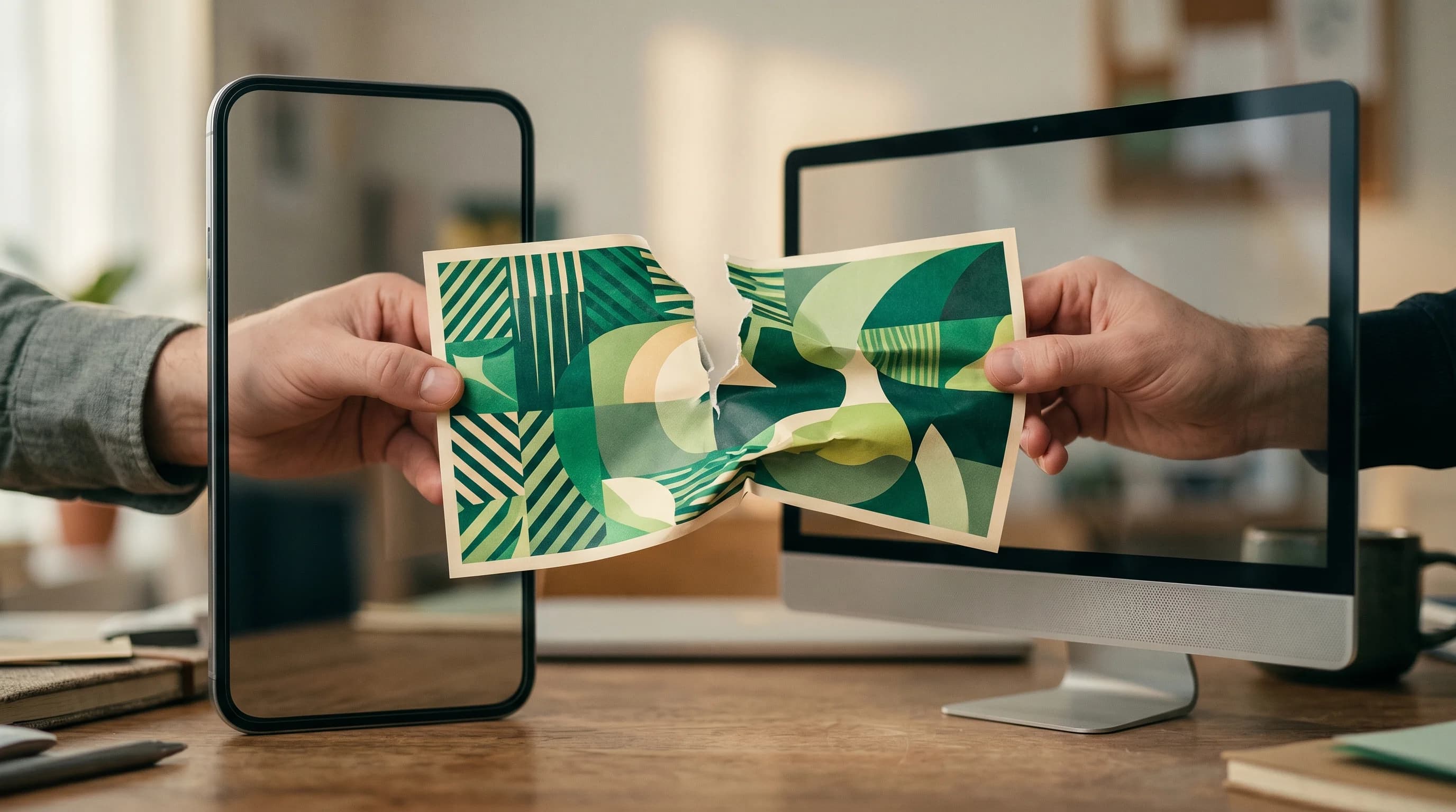
But here is the problem I keep running into when I talk to creators: almost everyone is designing their thumbnails as if the platform has one format. They build a visual system for their long-form videos — consistent color palette, recurring face placement, branded text style — and then either skip Shorts thumbnails entirely or squash the same 16:9 design into a 9:16 crop and call it done.
This does not work. And the data is pretty clear about why.
Shorts and Long-Form Are Different Distribution Systems
Before we get into design specifics, it is worth understanding why these two formats need separate thumbnail strategies. The answer comes down to where thumbnails actually appear in each format.
For long-form videos, your thumbnail is the primary click driver. It shows up on the YouTube home feed, in the Suggested sidebar, in Search results, and on your channel page. Every single time a new viewer encounters your video, they are making a judgment call based on a 1280x720 image. The thumbnail is doing the heavy lifting.
For Shorts, this relationship is almost completely inverted. In the main Shorts swipe feed — the vertical, full-screen experience where most Shorts are consumed — YouTube does not display your custom thumbnail at all. It pulls an auto-generated frame from the video itself. Your custom Shorts thumbnail only appears in three places: YouTube Search results for Shorts, your channel page Shorts tab, and in some Suggested Shorts panels.
That distinction matters enormously for strategy. A mediocre Shorts thumbnail in the swipe feed is irrelevant. A mediocre Shorts thumbnail on your channel page is the difference between a new visitor clicking into your Shorts catalog or bouncing.
The Conversion Math Behind Why This Matters
Channels that publish both Shorts and long-form content grow their subscriber base 3x faster than channels using only one format, according to YouTube's 2026 internal data. Their total watch time increases 2.5x in the first year. Those are not marginal improvements — they are transformative for channel trajectory.
The reason is simple. Shorts and long-form have completely different revenue and retention profiles:
- Shorts RPM: $0.03–$0.10 per 1,000 views
- Long-form RPM: $1.00–$10.00 per 1,000 views
A gap of roughly 20–30x. The practical implication: Shorts are a discovery engine, not a revenue engine. They bring new eyes to your channel. Long-form is where those eyes convert to watch time, ad revenue, and subscribers who come back.
A Short with 10,000 views brings 12–18 new subscribers on average. But those subscribers only generate meaningful revenue when they watch your long-form content. This means the Shorts-to-long-form conversion rate is probably the most underreported metric in creator analytics — and your thumbnail design is one of the biggest levers you have to move it.
What Makes a Shorts Thumbnail Different
Because the Shorts thumbnail only matters in specific secondary contexts (Search, channel page, Suggested panels), its design goals are different from a long-form thumbnail.
Long-form thumbnail goals:
- Stop the scroll in a crowded home feed
- Communicate the video's premise in under 50 milliseconds
- Create enough curiosity to trigger a click
- Build visual brand recognition over time
Shorts thumbnail goals:
- Create visual coherence when someone lands on your channel page
- Signal "this Short is part of a coherent channel with more to explore"
- Perform in a vertical crop that is often displayed very small
- Distinguish your Shorts from your long-form without confusion
These are fundamentally different jobs. Let me break down the design specifics for each.
Building Your Long-Form Thumbnail System
This is territory that most experienced creators have thought about, but a few 2026-specific updates are worth calling out.
Depth over flatness. YouTube's AI can now distinguish between flat images and images where the subject visually separates from the background. Images with a clear foreground-background depth relationship are seeing a 15% higher CTR compared to flat designs, according to recent analysis of 2026 thumbnail performance data. This means blurred backgrounds, dynamic compositions, and subjects that "pop" are getting rewarded in ways that purely flat design approaches are not.
The Z-pattern still works. High-performing thumbnails in 2026 tend to place emotional content in the top-left (a face, a reaction, a striking object), and hook text in the bottom-left or center-bottom. The eye travels in a Z-shape across the image. This is not new advice, but it is being validated by current CTR data.
CTR benchmarks by niche. For context on what "good" looks like right now: gaming and tech channels hit 8–15% CTR at their best; lifestyle and vlog channels average 4–8%; education channels often run 3–6%. If your long-form thumbnail CTR is consistently below 4%, the thumbnail is the variable to fix — not the title, not the content. (See our deep-dive on CTR by niche for niche-specific benchmarks.)
A consistent palette beats novelty. Research shows established channels with consistent thumbnail styling see 15–20% higher CTRs from returning subscribers compared to channels that vary their visual approach constantly. Build a visual system you can execute at speed, not a bespoke design for every video.
Stop guessing. Start testing thumbnails.
Paste any YouTube URL and get AI-branded thumbnails in under 60 seconds. Free to try.
Try Hooksnap FreeBuilding Your Shorts Thumbnail System
This is where most creators are leaving the most money on the table, because almost nobody thinks about Shorts thumbnails as a deliberate system.
Design for vertical from the start. Shorts thumbnails are 1080x1920 pixels (9:16 ratio). If you are starting from a 16:9 design and cropping, you are doing it backwards. Start with the vertical canvas. Place your subject in the center column, leave the top 15% and bottom 30% clear for safe-zone margins, and keep any text readable at thumbnail size — which on a phone is roughly 80x45 pixels.
The channel page browse experience. When a new viewer lands on your channel after discovering a Short, they see a grid of your Shorts. This is where Shorts thumbnails do their most important work. A coherent, recognizable set of Shorts thumbnails — consistent color treatment, consistent subject placement, consistent typography — signals "this creator knows what they are doing." A random collection of auto-generated frames signals the opposite.
Frame selection matters as much as design. Even if you do not create custom Shorts thumbnails, you should always manually select the frame that becomes your default image. YouTube lets you pick any frame from the Short as the default. Choose the frame where your face has the clearest expression, the action is at its peak, or the text overlay (if any) is most readable. This takes 30 seconds and outperforms whatever frame YouTube selects automatically.
Brand bridge design. The smartest approach is to create Shorts thumbnails that share a design language with your long-form thumbnails — same color palette, same font if there is text, similar subject treatment — but adapt for vertical format. This creates a coherent channel identity across both formats. A viewer who sees your Short on their Shorts feed, then lands on your channel page, should immediately recognize the visual connection between your Shorts library and your long-form catalog.
The Workflow Problem (And How to Solve It)
The main reason creators do not have separate thumbnail systems for Shorts and long-form is time. Creating one thumbnail is already a friction point for many creators. Creating two different thumbnails per piece of content feels like doubling the workload.
This is where batch production and AI generation tools change the equation significantly. If you are spending an hour per thumbnail on manual design, a tool that generates multiple thumbnail variants from a single video upload can cut that to under five minutes per video — freeing up time to actually run the two-system approach.
Here is the workflow I recommend for channels publishing both formats:
1. Design your long-form thumbnail first. This is your primary click driver and deserves the most design attention. Use it as your visual anchor for the piece of content.
2. Generate Shorts thumbnails in batches. If you are publishing, say, 4 Shorts per week, set aside one 30-minute session to generate thumbnails for all four. Use your established Shorts template — consistent layout, color palette, safe zones pre-marked — and swap out the subject-specific elements. AI thumbnail tools can generate variants quickly once your template parameters are set.
3. Use Shorts thumbnails as channel page curation. Think of your Shorts thumbnail grid as a portfolio. New visitors who land on your channel after discovering a Short are making a quick judgment about whether to subscribe. A curated, consistent Shorts thumbnail grid converts these visitors at a higher rate than a random-looking collection.
4. Audit monthly. Check your Shorts analytics for "Impressions from Channel Pages" and "Impressions from Browse features" specifically. If these are low relative to your Shorts swipe-feed impressions, your Shorts thumbnails are not doing their job and need attention. If you want to iterate faster on your long-form thumbnails, A/B testing multiple variants is the most reliable way to find what actually drives clicks for your specific audience.
The Conversion Trigger: Designing the Visual Bridge
The most sophisticated version of this system involves what I think of as a "visual bridge" — deliberate design choices that make a viewer's journey from Short to long-form feel coherent and inviting.
Here is the practical version of this:
When you publish a long-form video, extract the single most dramatic or interesting moment from that video. This becomes a Short. The Short's thumbnail — or at minimum, the frame you select as default — should visually reference the long-form thumbnail in some way. Same backdrop color. Same text style. Your face in the same quadrant of the frame.
The psychological effect is subtle but real. When a viewer finishes your Short and sees your channel page, they recognize the visual language immediately. The long-form video that spawned the Short looks familiar. The click to watch the full video feels like a natural continuation, not a new decision.
Creators who master this conversion loop see Shorts do something most creators never achieve: actually building their long-form audience rather than just inflating vanity metrics.
A Note on YouTube's Algorithm Shift
One more thing worth factoring into your planning. In January 2026, YouTube rewired its recommendation engine with Gemini AI. Among the changes: the algorithm now analyzes thumbnails at a semantic level, reading them the way a human would — understanding the emotional tone, visual composition, and even the consistency of your visual style across videos.
This means thumbnail consistency is now rewarded at the algorithm level, not just the viewer-psychology level. A channel that maintains a coherent visual identity across its long-form and Shorts libraries gives YouTube's recommendation system clearer signal about what kind of creator you are and who should be shown your content.
Building two intentional thumbnail systems — one for each format — and making those systems visually coherent with each other is now one of the strongest signals you can give both human viewers and the recommendation algorithm.
Where to Start
If this feels like a lot, here is the simplest version to implement this week:
- Stop letting YouTube auto-select frames for your Shorts. Manually pick the best frame for every Short you publish.
- Create a Shorts thumbnail template — even a simple one — with your channel colors, safe zones marked, and your face placement standardized.
- For your next long-form video, note the dominant color and composition, then use that as the palette anchor for the corresponding Shorts thumbnail.
- Check your Shorts analytics for channel page and browse impressions. That number tells you how hard your Shorts thumbnails are working.
The 200 billion daily views on Shorts represent the largest discovery surface YouTube has ever offered small and mid-size creators. Treating Shorts thumbnails as an afterthought is one of the fastest ways to underperform on a platform that is actively trying to push your content.
Two distinct thumbnail systems, designed to work together, is not twice the work. It is twice the impact.
Hooksnap generates thumbnails for both your long-form videos and Shorts from the same AI pipeline — so you can maintain visual consistency across formats without doubling your design workload. Start free →
See how Hooksnap creates click-worthy thumbnails
AI-powered thumbnail generation that helps your YouTube videos get more clicks.
View PlansRelated Articles
YouTube Shorts Thumbnails: Custom Design Guide (2026)
Complete guide to YouTube Shorts thumbnails: custom upload setup, 1080x1920 specs, safe zones, and design tips that boost CTR by up to 140%.
Do YouTube Shorts Thumbnails Matter? What the Data Says in 2026
YouTube Shorts thumbnails boost CTR by 140% on the homepage and 85% in search. Learn when they matter and how to design them for more views.

YouTube Shorts Disable Is Here: Fix Your Thumbnail Strategy
YouTube now lets users turn off Shorts entirely. Here is how to adapt your long-form thumbnail strategy when Shorts-based discovery stops working.
Ready to boost your CTR?
Stop losing clicks to boring thumbnails. Get AI-generated thumbnails in under 60 seconds.
Get Started Free