YouTube's 3 Audience Segments: Thumbnail Strategy for Each
YouTube classifies your audience into new, casual, and regular viewers. Each clicks for different reasons. Design thumbnails that convert all three.
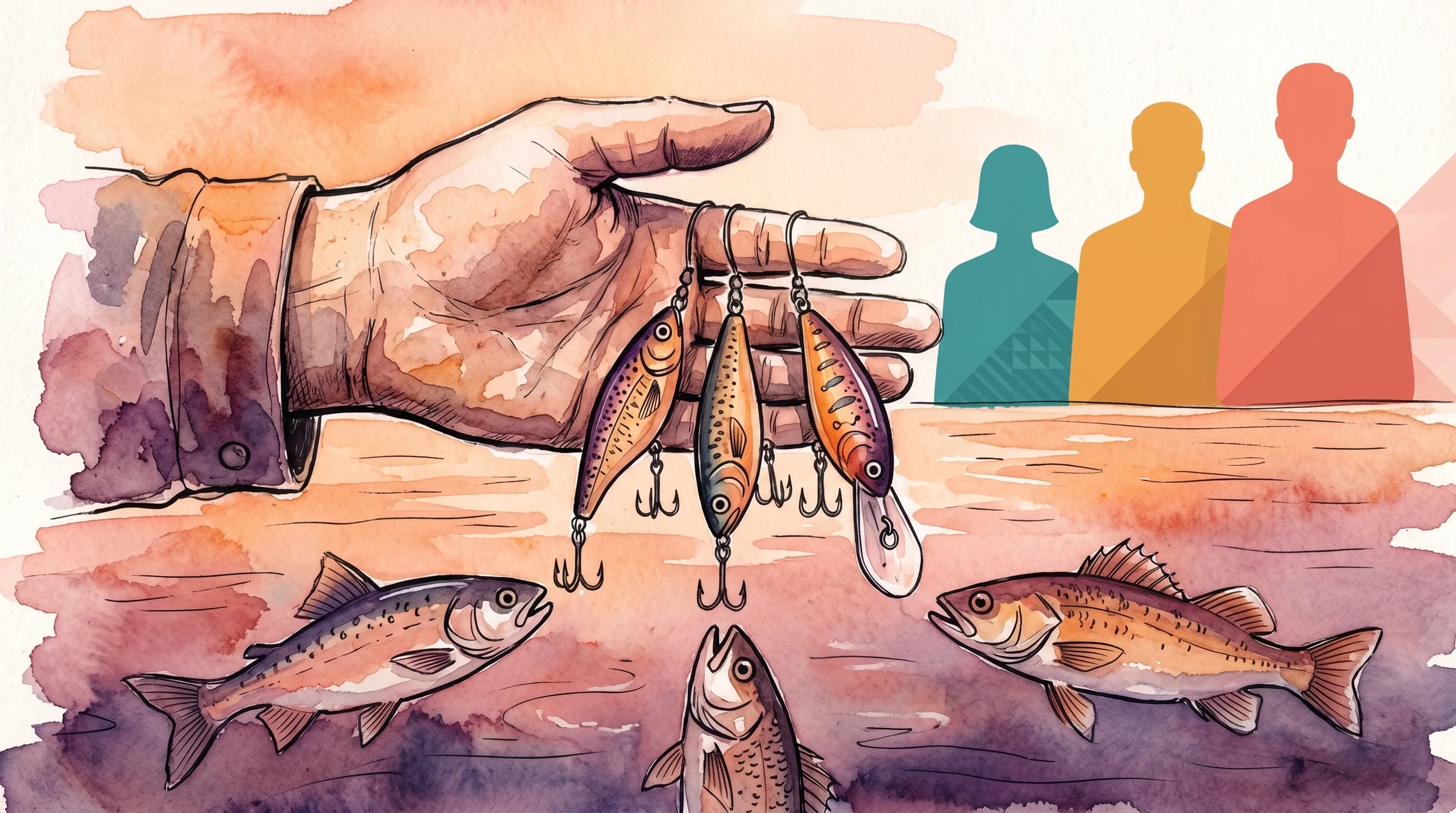
Most creators design one thumbnail and hope it works for everyone. That was a reasonable bet when YouTube only showed you "new" and "returning" viewers in analytics. But YouTube quietly replaced that binary split with something far more useful: three distinct audience segments that tell you exactly where your growth is stuck.
The segments are new viewers, casual viewers, and regular viewers. Each group sees your thumbnail in a different context, judges it by different criteria, and needs a different visual signal to click. If you treat them the same, you are optimizing for one group at the expense of the other two.
I have been studying how these segments interact with thumbnail design since YouTube rolled out the updated analytics. This post breaks down what each segment actually is, why they respond to different design choices, and the specific thumbnail strategies that move the needle for each one.
What YouTube Means by New, Casual, and Regular Viewers
YouTube replaced the old "new vs. returning" viewer binary in favor of a three-tier classification system that measures engagement frequency over the past 12 months.
Here is how each segment is defined:
New viewers are watching your channel for the first time. They have zero history with your brand, your style, or your content. They are cold traffic.
Casual viewers have watched your channel at least once per month for one to five months in the past year. They know you exist. They might recognize your face or channel name. But they are not committed.
Regular viewers have returned to watch your content for at least six months in the past year. These are your core audience. They subscribe, they click notifications, and they actively look for your uploads.
The shift matters because each segment has radically different familiarity with your channel. A regular viewer has seen hundreds of your thumbnails. A new viewer has seen zero. Designing for both with the same image is like writing a cover letter and a love letter in the same document.
Why This Changes Your Thumbnail Strategy
The old model was simple: returning viewers know you, new viewers do not. The three-segment model adds a middle layer that changes everything.
Casual viewers are the growth engine most creators ignore. According to YouTube's own guidance, converting casual viewers into regulars is the single most impactful action for sustainable channel growth. And thumbnails play a direct role in that conversion.
Here is the core insight: your thumbnail serves a different function for each segment.
For new viewers, your thumbnail is a first impression. It competes against dozens of other thumbnails from channels they already follow. It needs to stop the scroll and communicate value in under 1.5 seconds.
For casual viewers, your thumbnail is a reminder. They have seen you before but have not committed. Your thumbnail needs to signal consistency and reinforce the value they got last time.
For regular viewers, your thumbnail is a notification. They are already looking for your content. Your thumbnail mainly needs to be recognizable and communicate what this specific video is about.
Most creators over-optimize for regular viewers (because that is who comments and engages) while ignoring the design signals that convert new and casual viewers. The analytics tab now makes this visible.
How to Read Your Audience Segment Data
Before redesigning anything, check where your channel actually stands. In YouTube Studio, navigate to Analytics > Audience and look at the viewer segment breakdown.
A healthy growing channel typically shows a ratio around 40% new viewers, 35% casual viewers, and 25% regular viewers. Channels with return viewer rates above 10% are showing strong audience retention signals that the algorithm rewards with broader distribution.
If your new viewer percentage is below 30%, your thumbnails are probably too niche-coded. They rely on inside references or channel-specific visual language that cold audiences cannot parse.
If your casual viewer percentage is shrinking while new stays high, you have a retention design problem. People click once, enjoy the content, but your thumbnails are not distinctive enough for them to recognize you the next time you appear in their feed.
If your regular viewer percentage dominates (above 40%), you are preaching to the choir. Your thumbnails are comfortable for your core audience but not doing the work of attracting new eyeballs.
Thumbnail Strategy for New Viewers: Pattern Interruption
New viewers encounter your thumbnail in the Browse feed or Suggested Videos alongside creators they already watch. Your thumbnail is literally competing against their favorites.
The data is clear on what works for cold audiences. Research shared by TubeBuddy shows that expressive faces can lift CTR by 20-30% with new audiences, and approximately 73% of top-performing thumbnails use exactly two to three bold words.
Here are the design principles that matter most for new viewers:
1. Lead with Emotion, Not Brand
New viewers do not know your logo, your color scheme, or your recurring thumbnail format. Those visual cues are meaningless to them. What catches a cold audience is genuine emotional expression combined with a clear visual promise.
YouTube's algorithm in 2026 increasingly surfaces thumbnails that show authentic micro-expressions and real skin texture over hyper-polished AI faces. Thumbnails with natural lighting and candid shots show a 22% higher satisfaction rate compared to synthetic equivalents.
2. Maximize Contrast for the Browse Feed
New viewers primarily discover you through Browse and Suggested — surfaces where your thumbnail sits in a grid alongside 20+ others. In 2026, 82% of mobile viewers browse YouTube in dark mode, which means your thumbnail needs to pop against a near-black background.
Use high-saturation colors and hard edges. Avoid gray or muted tones. The thumbnails that survive the dark mode grid are the ones with clear figure-ground separation — a bright subject against a contrasting background.
3. Three Words Maximum
Text on thumbnails should be the shortest phrase that triggers curiosity or communicates clear value. For new viewers who have no context about your channel, every word needs to carry weight.
The winning formula for cold traffic: a strong emotion face + two to three words of high-contrast text + one clear subject. That is it. Anything more requires context the new viewer does not have.
4. Avoid Channel-Specific Inside References
Your regular viewers will get "Part 47" or a running joke title. New viewers will scroll right past it. If the thumbnail requires any prior knowledge to understand, it is invisible to new audiences.
Every thumbnail should be self-contained enough that someone who has never heard of you can understand the value proposition in a single glance.
Thumbnail Strategy for Casual Viewers: Recognition and Consistency
Casual viewers are the segment with the highest conversion potential. They clicked before. They watched. They just have not made it a habit yet. Your job is to make your thumbnails unmistakably yours so they spot you in a crowded feed and think: "Oh, that channel. I liked that last video."
Research from TubeBuddy indicates that established channels with consistent thumbnail styling see 15-20% higher CTRs from returning audiences compared to channels with inconsistent approaches.
1. Build a Recognizable Template System
Casual viewers need to connect your new video to the positive experience they had before. A consistent thumbnail template — same font, same general color palette, same layout structure — creates that instant recognition.
This does not mean every thumbnail looks identical. It means every thumbnail clearly belongs to the same family. Think of it like a Netflix show row: each episode has a different scene, but the visual grammar is unmistakably the same series.
2. Position Your Face Consistently
If you use your face in thumbnails, keep it in the same region across videos. Casual viewers form visual memory of your thumbnail pattern. When your face consistently appears in the left third, their eyes learn to scan that zone first. Moving it around forces them to re-process each thumbnail as if it were new.
3. Use Series or Content Format Signals
Casual viewers responded to a specific video of yours. Give them visual cues that connect new uploads to what they already liked. Color-coded series, recurring visual motifs, or consistent text treatment for specific content formats all help casual viewers self-select the content they are most likely to enjoy.
For example, if your tutorial videos use a blue color scheme and your reaction videos use red, a casual viewer who clicked a tutorial can quickly spot the next tutorial in their feed.
4. Upgrade Without Reinventing
When you refresh your thumbnail style, do it incrementally. A complete rebrand can confuse casual viewers who are still building familiarity with your visual identity. Change one element at a time — update the font this month, shift the color palette next month — so casual viewers can track the evolution.
Thumbnail Strategy for Regular Viewers: Clarity and Novelty
Regular viewers are already sold on your channel. They are not deciding whether to watch you — they are deciding whether to watch this specific video. Your thumbnail strategy for regulars is about communicating what makes this video different from your last one.
1. Prioritize Topic Clarity Over Clickability
Regular viewers do not need to be convinced. They need information. What is this video about? Is it the topic they have been waiting for? A regular viewer scanning their subscription feed wants to quickly match your latest upload against their current interest.
Heavy clickbait elements that work on new viewers (shock faces, vague curiosity gaps) can actually backfire with regulars. They have seen those patterns from you before. What holds their attention is specificity: clear visual indication of the topic, the guest, or the hook that makes this video worth watching right now.
2. Introduce Controlled Novelty
While consistency matters for casual viewers, regular viewers have high familiarity with your template. They can get thumbnail fatigue if every upload looks exactly the same. Introduce small variations — a different background treatment, a seasonal color shift, a special badge for milestone videos — to keep the template fresh without breaking recognition.
The balance is: 80% template consistency, 20% per-video novelty. Enough structure to be instantly recognizable, enough variation to feel new.
3. Use the Title-Thumbnail Unit
Regular viewers are the segment most likely to read both your thumbnail and title together as a single unit. For this group, your thumbnail does not need to carry the full message alone. Design the thumbnail and title as complementary pieces where neither repeats the other.
The Segment-First Thumbnail Audit
Here is a practical framework for auditing your existing thumbnails through the lens of audience segments. Run this on your last 10 uploads:
Step 1: Check your segment split. Open YouTube Studio > Analytics > Audience. Note your new/casual/regular percentages.
Step 2: Identify your weakest segment. If new viewers are low, your thumbnails are not breaking through to cold audiences. If casual conversion is weak, your visual identity is not consistent enough. If regular engagement is declining, you might have template fatigue.
Step 3: Pick three recent videos and evaluate each thumbnail against the relevant segment criteria.
For each thumbnail, ask:
- Would someone who has never seen my channel understand this in 1.5 seconds? (New viewer test)
- Does this clearly belong to my channel's visual family? (Casual viewer test)
- Does this communicate what makes this video specifically worth watching? (Regular viewer test)
Step 4: Redesign the weakest thumbnails for your weakest segment. Do not try to fix all three segments at once. Pick the one with the most growth potential and focus there for your next 5-10 uploads. Then measure the segment shift.
Practical Design Checklist by Segment
| Design Element | New Viewers | Casual Viewers | Regular Viewers |
|---|---|---|---|
| Face | Genuine emotion, natural | Consistent position | Topic-relevant expression |
| Text | 2-3 curiosity words | Brand font, series labels | Specific topic indicator |
| Colors | High contrast, bold | Template palette | Template + seasonal variation |
| Layout | Clear figure-ground | Repeatable structure | Familiar but not identical |
| Context needed | Zero (self-contained) | Low (visual memory) | High (builds on channel knowledge) |
| Primary job | Stop the scroll | Trigger recognition | Communicate topic |
How to Measure Impact
After adjusting your thumbnails for a specific segment, track these metrics over 2-4 weeks:
For new viewer improvements: Watch your Browse and Suggested CTR in the traffic sources report. Also track the absolute number of new viewers in the Audience tab. If new viewers climb while your overall CTR holds steady or improves, the changes are working.
For casual viewer improvements: Monitor the casual-to-regular conversion. YouTube does not show this directly, but you can track it indirectly: if your casual viewer count stays stable or grows while your regular viewer count increases, you are converting casuals. Also check your subscriber conversion rate — casuals who subscribe are becoming regulars.
For regular viewer improvements: Track average view duration and returning viewer CTR. Regulars who are engaged with your thumbnail evolution will maintain or improve their watch time. If regular viewer CTR drops after a design change, you have deviated too far from your template.
Common Mistakes and How to Fix Them
Mistake: Designing all thumbnails for your regular viewers. This is the most common error. Regular viewers are loud (they comment, they like, they message you). But if 60% of your growth potential lives in new and casual segments, you are leaving reach on the table.
Fix: For every thumbnail, run the "zero context" test. Show it to someone who has never seen your channel. Can they tell what the video is about and why they should care? If not, your thumbnail is too insider-coded.
Mistake: Changing your visual identity too frequently. Some creators reinvent their thumbnail style every month. This kills casual viewer recognition. Casual viewers need 3-5 exposures to build visual familiarity, and if you change the template before that window closes, you are resetting their memory every time.
Fix: Commit to a template for at least 8-12 weeks. Test one variable at a time within that template using YouTube's Test & Compare feature.
Mistake: Ignoring dark mode. With the majority of viewers browsing in dark mode, thumbnails designed on a white canvas in Photoshop or Canva look completely different in context. A thumbnail that pops on a white background may disappear into a dark feed.
Fix: Always preview your thumbnail on a dark background before publishing. Better yet, use a tool that automatically checks dark mode contrast as part of the generation workflow.
Building a Thumbnail System That Serves All Three Segments
The goal is not three separate thumbnails per video (though YouTube's localized thumbnails feature hints at that future). The goal is a single thumbnail that layers signals for all three segments simultaneously.
The anatomy of a segment-optimized thumbnail:
- Base layer (for new viewers): High-contrast subject with genuine emotion. Self-contained meaning.
- Template layer (for casual viewers): Consistent font, color palette, and layout grid. Your visual signature.
- Context layer (for regular viewers): Topic-specific elements, series indicators, or subtle references that reward familiarity.
When these three layers work together, your thumbnail attracts cold traffic, reinforces brand memory for warm traffic, and communicates specific value for your core audience — all in the same image.
Tools like Hooksnap help with this by analyzing your video content and generating thumbnail variants that you can evaluate against each segment. The AI understands your existing visual template (casual viewer consistency) while optimizing for scroll-stopping impact (new viewer attraction) and topic clarity (regular viewer communication).
The Bottom Line
YouTube gave you a more detailed map of your audience. Use it.
Check your segment split this week. Identify which group you are underserving. Apply the design framework that matches your weakest segment. Measure the shift over 2-4 weeks. Adjust.
The creators who grow in 2026 are not the ones with the prettiest thumbnails. They are the ones who understand that different viewers need different signals — and design accordingly.
Stop guessing. Start testing thumbnails.
Paste any YouTube URL and get AI-branded thumbnails in under 60 seconds. Free to try.
Try Hooksnap FreeSee how Hooksnap creates click-worthy thumbnails
AI-powered thumbnail generation that helps your YouTube videos get more clicks.
View PlansRelated Articles

YouTube Impressions: How the Algorithm Decides Who Sees Your Thumbnail
Your thumbnail can't get clicks if nobody sees it. Here's how YouTube's impression system works in 2026 and what triggers the algorithm to expand distribution.
YouTube Thumbnail CTR by Traffic Source: A Design Guide
Search, Browse, and Suggested Videos each reward different thumbnail styles. Match your design to the traffic source and watch your CTR climb.
YouTube's Browse Feed Changed: Redesign Your Thumbnails Now
YouTube's 2026 Browse feed now clusters viewers by micro-niche. Your thumbnails compete in tighter pools — here's how to adapt.
Ready to boost your CTR?
Stop losing clicks to boring thumbnails. Get AI-generated thumbnails in under 60 seconds.
Get Started Free